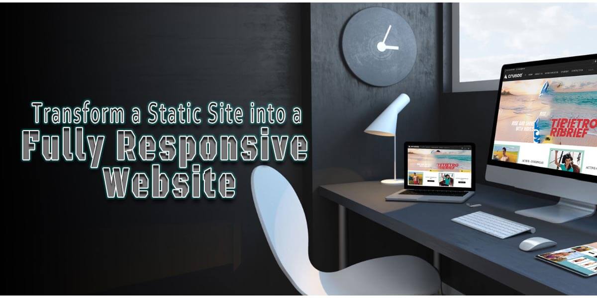
Creating websites that work seamlessly across devices has become essential in today’s digital landscape. Responsive Website design ensures an optimized experience for users on everything from desktop to mobile. In this comprehensive guide, we’ll walk through assessing an existing static site and transforming it into a fluid, fully responsive design.
But first, let’s define some key terms. A static site uses HTML, CSS and JavaScript but lacks a content management system (CMS) for dynamic content updates. While simple to build, static sites often lack flexibility and responsiveness out of the box. Responsive Website design, on the other hand, uses fluid layouts that automatically adjust based on screen size, resolution, orientation and other factors.
The main technologies involved are HTML, CSS and JavaScript. HTML provides content structure, CSS handles layout and styling, while JavaScript enhances interactivity. We’ll leverage these languages along with Responsive Website frameworks and techniques. The end result will be a site that reliably adapts to any device or browser.
Our process will involve: conducting a thorough audit of the current site, setting up a local development environment, converting the design to be fully responsive, integrating a headless CMS for content management, and implementing advanced features. We’ll then cover deployment, maintenance and next steps. By following these guidelines, any existing static site can gain a modern, user-friendly design without a complete rebuild.
Conducting an Audit
Before making any modifications, it is critical to thoroughly examine the current site. This phase of evaluation establishes the groundwork for a successful transformation. We’ll go over all of the material, design elements, programming tools, and other aspects.
Begin by looking over each page’s specific purpose and vital information. Make a list of content kinds to better understand frequent trends. This will aid in the development of standard templates in the future. You should also sketch out the present site architecture, technologies, and code structure. Take note of any inefficiencies or redundancies.
The design should then be evaluated. What is the current structure and flow of content across devices? Use browser developer tools to simulate mobile, tablet, and desktop views, noting any issues that arise. Collect feedback from relevant stakeholders as well.
Testing usability is also essential. To identify friction areas, try finishing typical chores on various screens. Note observations such as ambiguous calls to action or illegible text sizes.
Lastly, use your analysis to set goals for the new design. Desired load times, support for assistive technology, and user task priorities are a few things to think about. Clearly defined goals will direct subsequent choices.
After completing a comprehensive audit, you have a clear picture of the situation and a plan for improvement. The project is set up for success during this evaluation phase.
Setting Up a Local Development Environment

Before touching any code, set up a local dev stack that mirrors your live site. This allows safe testing changes without affecting current users. First, download all project files from your hosting provider. Make sure to get code, images, and any other assets. Next, choose a local development server like MAMP, WAMP, or Laragon—these bundle essential software like PHP, MySQL, and web servers. Follow the instructions to install and configure the stack on your machine.
Verify everything is working correctly by loading index.html locally. You should see an identical version of the live site. It’s also crucial to establish version control from the start. Git is the de facto standard, so install Git on your machine and initialize a new repository. Connect your local Git repo to a code hosting platform like GitHub. This provides a backup of your work as well as collaboration features. Learn basic Git commands like add, commit, push, and pull to track changes.
With your local dev environment and version control configured, you have everything needed to start transforming the site safely. Let’s now examine the code changes required for Responsive Website design.
Converting to Responsive Website Design
Now that preparation is complete, it’s time to update the code for flexibility across viewports. We’ll cover core techniques like fluid grids, responsive images, and adaptive navigation.
Viewport Meta Tag
First, add the viewport meta tag within <head> to enable responsiveness:
<meta name="viewport" content="width=device-width, initial-scale=1.0">
Relative Units
Next, convert fixed-width CSS-like pixels to relative units like ems, rems, or percentages. This allows elements to adapt to parent container sizes.
Responsive Grid System
Add a grid framework such as Bootstrap or use CSS Grid for flexible, media query-driven layouts. Define breakpoints and column counts for different screen widths.
Responsive Website Images
Optimize image sizes and add HTML5 srcset/sizes attributes. Or use CSS to max-width images at 100% for scaling. Consider SVG, raster, or icon fonts too.
Adaptive Navigation
Use media queries to hide/show navigation links responsively. Add a hamburger menu icon to trigger expanded mobile navigation.
Accessible Forms
Add label/field associations, proper text sizing, and spacing. Style form controls to stack vertically on narrow screens.
Other Patterns
Make embedded media, tables, and non-semantic elements like hero banners resize responsively. Add ARIA attributes to enhance accessibility.
Browser Testing
Rigorously test all pages, links, and functionality across devices before proceeding. Use browser dev tools to debug any issues. With these foundational techniques in place, the site layout and components are now flexible based on viewport dimensions. Let’s dive deeper into a specific implementation.
Implementing a Responsive Grid Framework
Leveraging a CSS grid framework is ideal for easy, standards-based, Responsive Website design. In this section, we’ll set up the popular Bootstrap framework.
First, include Bootstrap’s CSS link in the <head> along with the responsive meta tag added earlier:
<link rel="stylesheet" href="bootstrap.min.css">
Bootstrap utilizes a 12-column, responsive grid system out of the box. To use this, wrap content in a .container, then .row and .col– columns:
<div class="container">
  <div class="row">
    <div class="col-md-8">
      <!-- Content -->
    </div>
    <div class="col-md-4">
      <!-- Content -->
    </div>
  </div>
</div>
This creates two equal-width columns on medium+ screens due to col-md-. Bootstrap also provides helper classes for offsets, pushes, pulls, and more. You can modify the default grid by changing its container width and column sizes using Sass. Or extend it with custom breakpoints and widths.
Bootstrap includes pre-built components for common patterns like navigation, carousels, and forms. We’ll leverage these throughout for faster development. With the grid and framework set up, the site layout is now fully responsive. Let’s dive into specific elements.
Read More: Building Stunning Websites with Divi WordPress Game Changer
Responsive Navigation
We’ll build an accessible, responsive navigation menu using Bootstrap. First, add markup for the navbar container:
<nav class="navbar navbar-expand-lg navbar-light bg-light">
</nav>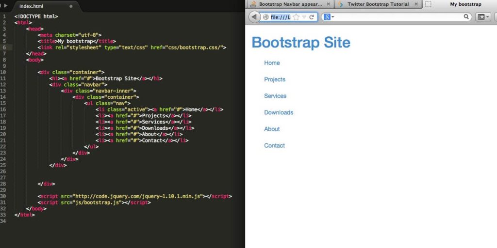
Within, add the brand/logo and unordered list of links:
<a class="navbar-brand" href="#">Logo</a>

<button class="navbar-toggler" type="button" data-toggle="collapse" data-target="#navbarNav">
  <span class="navbar-toggler-icon"></span>
</button>

<div class="collapse navbar-collapse" id="navbarNav">

  <ul class="navbar-nav">
    <li class="nav-item">
      <a class="nav-link" href="#">Link 1</a>
    </li>
  </ul>

</div>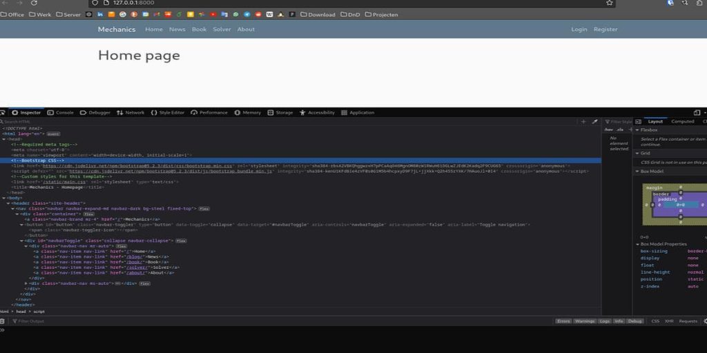
This will collapse into a Responsive Website toggle menu on small screens using Bootstrap’s JavaScript. Style as needed for your brand. Don’t forget ARIA roles like menu and aria expanded for accessibility. Add skip links, proper color contrast, and more. With the navigation out of the way, users can now easily access core site areas from any device.
Integrating a Headless CMS
While the site is responsive, a static site lacks content management. Let’s integrate a headless CMS using the popular Sanity.io platform. First, sign up and install the Sanity CLI:
npm install -g @sanity/cliThen, initialize a new Sanity project:
sanity initThis scaffolds the CMS configuration. Next, define content models and schemas within the studio folder:
export default {
  name: 'blogPost',
  type: 'document',
  title: 'Blog Post',
  fields: [
    {
      name: 'title',
      type: 'string'
    },
    // etc
  ]
}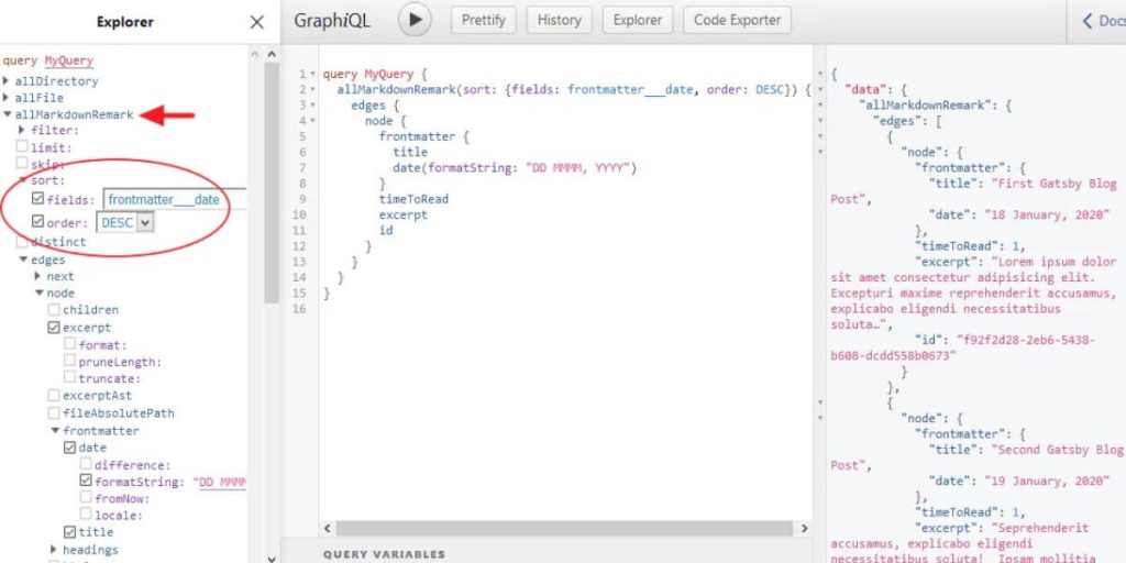
Now install the Sanity client library and connect to the API:
import { createClient } from 'sanity-client'

const client = createClient({
  projectId: 'your-project-id',
  dataset: 'production'
})
Conclusion
In this comprehensive guide, we’ve covered transforming an existing static site into a fully-fledged responsive website. By conducting a thorough audit, establishing version control, and implementing foundational Responsive Website design patterns, any site can now adapt to various screen sizes.
Leveraging a grid framework like Bootstrap simplifies the process while providing tried-and-tested solutions out of the box. Integrating a headless CMS unlocks the ability for non-technical users to manage content efficiently.
With the CMS, advanced features can be developed to enhance the user experience. Search functionality ensures visitors can find relevant information. E-commerce integrations allow for generating revenue. Analytics provide insights to optimize continually.
Rigorous testing across devices ensures bugs are caught before launch. Deploying to a live server then makes the new responsive design available to users worldwide. Continuous integration automates deploys while performance monitoring keeps things running smoothly.
Following this step-by-step guide, any team can transform their static site infrastructure to support modern responsive design best practices. The resulting fluid, mobile-friendly experience will benefit users and search engines alike.
While front-end technologies continue evolving rapidly, the core principles of responsive web design remain highly relevant. Ongoing learning is critical to staying on top of emerging trends. Resources are included to support further optimizing long after launch.
With consideration for users on all devices and platforms, your transformed site will provide an engaging digital experience for today and into the future. Empower visitors by embracing a user-centered approach through responsive design.